Showing posts with label School. Show all posts

9.4.13

Drawing People??

What's that? Drawing people with skin and clothes and everything? Shock.
Boy was I rusty. But here are some layouts with the sketches I liked best. The idea was to create some sort of relationship or narrative between the characters but I'll leave that to your imagination.
I went for a sort of dark and mysterious layout for the first one. I gotta say, the scratchy, bold, collage [somewhat Dadaist] style was a great push for me. I enjoyed getting into it immensely.
In contrast, the second layout has a light, romantic feeling. For some reason the models really liked poses with their chins tipped up so I played around with the mood of that for the second layout. Lovers from different centuries? Haha.


Best: The models we worked with were amazing! They all gave such striking, dramatic poses and were such stars about wearing uncomfortable costumes and wigs. I really enjoyed listening to fitting movie ost's while I drew. It doesn't get better than listening to POTC ost while drawing a pirate.
Worst: Having to suck up how rusty I was and just dive into it. You know, those first warm up sketches when you end up with a page full of crap and you just have to tell yourself to keep at it because in 20 minutes, better things will be landing on the page [just me?]

6.4.13

12x12

Hey guys,

So all the third year illustration students at Sheridan got a 12" x 12" board to do anything they wanted with. The boards will be on display together as an amalgamation of 3rd year insanity creative prowess. 
When deciding what to do with my board, I tried to combine several things that I care about: Scientific/medical illustration, typography, and coffee, as well as connecting people's random thoughts. Detailed explanation and final photos are coming soon. For now, here's a sneak peek of what I did:


Q: My friend walked in on me working on this and said, "I'm no longer surprised to see you drawing dead things." haha, made me laugh.

25.3.13

Take Off

Here is the final product of the plane model . I figured I might as well milk that Boeing model and render it from a bunch of different angles. And then I got this great idea to work with it in 3D at the print level as well. So I did that second part just for kicks, it was fun. And this project totally made me want to fly a plane [better in my head than in reality I suspect].

18.3.13

Flight in progress

Hello Folks,

Here's a quick update on a project I'm working on. The idea is to take a set of existing blueprints and render/paint a 3d image from them. I chose a Boeing F4B4 (P12) because flight is such a fun topic and there's something about those old, colourful, somewhat unreliable airplanes that I really enjoy. So here are some process images. Final renders sooooon!


Ahaha I accidentally left in this backwall that I just noticed, is casting a weird shadow on the bottom-right plane. It looks like there's some insanely huge monument that it's flying past.

9.3.13

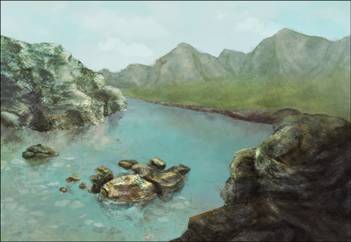
Landscape Painting

Trying to digital paint a landscape. I have never stared so hard at rocks before. I have a new respect for concept artists! I used the Isle of Skye for reference. Such a beautiful place! I'd love to go one day.


27.2.13

!deas Gallery Proposal - OSC

Here's a project proposal for the !dea Gallery at the Ontario Science Centre. The project was a collaboration between Jessy Chung and I. I felt really blessed to have had such an amazing partner to work with. We kept the design aspects consistent through constant communication and that really kept the project on its feet.
The in depth explanation of different elements is in there but basically, the exhibition was designed to explain to the public, what scientific illustration is. We tied together the themes, timelines, and subject matter with DNA. We felt that this would be appropriate because scientific illustration deals with the natural world and life sciences and DNA is common to all living things. Overall, we tried to make use of the many screens in the space and address the issue of interaction with viewers of different ages.


BEST: The best part of the project was definitely having someone to hash out ideas with and build on top of existing ideas to make them better.

WORST: I can't say there was anything that I didn't love about this project except for the timeline. We had to complete it in a pretty tight time frame considering that it was a group of two. That was a little bit stressful but it definitely made it an unforgettable learning experience.

19.2.13

Upright Piano [cutaway]

The piano is done!!! Screw you gradients, bane of my existence.
Best: Watching the parts fall into place and seeing some dimension appear as the texture and gradients were added. Also, I have to say, I am really loving those red arrows in the bottom right diagram.
Worst: Adding the texture and gradients.

24.1.13

Piscivore [old+new]

A reworking of an old project. You can compare the two just to see the different approaches I took. In the old version, I was basing a lot of the shapes on the swooping motions that each of the birds used in fishing. I also chose to show the full body of the birds in their water environments but stylized the water [which was an experimental approach] to draw together the organic birds with the geometric backdrop.
In the new version, I opted for a closeup view of each bird because I felt that a more detailed view of the actual fishing mechanism of each bird was more important than seeing their full body. Additionally, I went for a lighter palette so that the background did not overshadow the main content. Finally I cleaned up the sequential diagrams, turning them into vectors just for clarity's sake. There's a time to use pixels and then there's a time for clean, crisp, vectors. I actually learned a lot from making myself go through this exercise. I'm very pleased with the new version.

New


Old

9.1.13

Intrinsic Elements of the Hand

Some media explorations paired with hand sketches. This was exploratory on almost all fronts. I haven't tried anything like this before, aside from the first pencil sketches, so it was very fun. Backgrounds were made with tea, coffee, chalk pastel, and watercolour.


Best: Fiddling with textures digitally and physically.
Worst: Carpals. After pisiform I've got no landmarks.

+ one of our profs just shared this article. Here's a small exerpt:
"In this country, there are almost twice as many neurosurgeons as there are professional illustrators. There are eleven times as many certified mechanics. There are SEVENTY times as many people in the IT field.
So, given that they are less rare, and therefore less in demand, would it make sense to ask your mechanic to work on your car for free? Would you look him in the eye, with a straight face, and tell him that his compensation would be the ability to have his work shown to others as you drive down the street?
Would you offer a neurosurgeon the “opportunity” to add your name to his resume as payment for removing that pesky tumor? (Maybe you could offer him “a few bucks” for “materials”. What a deal!)
Would you be able to seriously even CONSIDER offering your web hosting service the chance to have people see their work, by viewing your website, as their payment for hosting you?" (retrieved from: http://positionrelative.wordpress.com/)

1.12.12

plankton: Siphonophore

The assignment: illustrate the structure, story, or setting of any plankton. Of course, I chose the thing with a million tentacles because what's the point of doing a simple illustration when you could just pull all your hair out? 8D
Meet the Portuguese Man O' War. It's a siphonophore and it is not a jellyfish!

Worst: Those crazy gastrozooids and gonozooids. Trying to find out which was which and how to differentiate/whether or not it's possible to tell from whatever distance was just terrible. Most closeup photos or videos of the siphonophore were unlabeled or only vaguely eluded to which parts were which. Mostly because, at this distance, the gastrozooids and gonozooids look the same. However, under closer microscopic observation they would look vastly different.
Best: After the line work was done, painting this thing was really fun. Also, solving the challenge of finding shortcuts for drawing a million zooids without it being obviously cheated/copy pasted was rewarding.

28.11.12

Egg Timer Exploded View

ASSIGNMENT: Pick an object with an outer casing and do an exploded view of it.
Who doesn't love exploding chicken? This is what the inside of an egg timer looks like. More parts than it seems from the outside.


BEST: Breaking it apart was pretty fun, and modelling it was great once I got into the rhythm of things. This was definitely a great learning experience for figuring out how winding, time keeping mechanisms work.


WORST: Measuring everything accurately down to the last thousandth of an inch. Also, I very cleverly [sarcasm] decided to model this in sketchup and import it as a pdf into illustrator. Stuupid move. There was a lot of fixing that had to go on in illustrator as sketchup does not like curved surfaces and insists on creating jagged edges. I absolutely had the time of my life fixing those springs in illustrator.

16.11.12

generic Plant Cell

Here's a plant cell illustration with images of what multiple cells look like and what the membrane structure is made of. Learn something new everyday =D

BEST: I've always loved biology textbook illustrations so it was cool to be on the other end of the information communication system.

WORST: I chose to work with a limited colour palette so differentiating all the different organelle, especially the ones that look similar [golgi, ERs] got really challenging. And overall getting little details correct.

13.11.12

Conceptual SLR

Conceptual model of an SLR camera showing the movement of light through the lense and body of the camera.
Also, thought I'd share this TEDtalk on 3D printing human organs. Crazy, cool stuff!

25.10.12

axonometric BATHROOM

Axonometric of a bathroom including a cabinet oblique of a tissue dispenser. At first I tried to fight the pink but at 12am, I decided to stop fighting what came naturally and just go pink. Especially since the breast cancer awareness campaigns have turned pink into an icon of femininity, it seems to be fitting for this graphic.

And I added in the little bathroom people as a sort of instructable because not everyone knows how to use the bathroom ;]


11.10.12

Botanical

Traditional timee. Here are some botanical ink illustrations using different techniques.


nib


Stippling! That's right, 1/10th of the way in,
I already regretted using that 005 micron.


Brush. Shading perpendicular to the veins.
Brush. Shading following the light
Okay this one is actually done on Illustrator using the pen tool.
First time doing something like that with Illustrator.

7.10.12

Nature Journaling

Some nature journaling sketches. I gotta say, as a nature noob, pretty much everything looks interesting and new to me.


Woah, some of the colours are reproducing kinda psychedelic. Put on some sunglasses and look at them, it'll look more like the original =D

20.4.12

Bombardier Beetle

Hey guys!
I just finished my last assignment for the year. What a weird feeling, to not have anything due next week.

Anyway, the objective was to illustrate some sort of process or function of a bug. I chose something more internal because bombardier beetles are amazing on the inside.

Enjoy and for anyone who is having great weather [as we are], hope you're savouring it!

17.4.12

it's a SHED

Hey guys!
Here's a simple garden shed design, modeled in Sketchup and rendered in Kerkythea.
rendered front and back


rendered exploded view


instructive exploded view


8.2.12

BIRDS [cont.]


So I forgot to upload these with the bird diagrams. Here are some sketches and rough research to accompany the hawk wing and ani topography. Fun stuff!


The hawks were drawn from two visiting hawks from the Peregrine Foundation. All the other birds are referenced from the ROM's stuffed collection.


2.2.12

BIRDS

Hey guys,
Here's a topographical study and wing study of a Smooth-billed Ani and Red-tailed Hawk [respectively].


W O R S T :
I think the biggest challenges for this project had to be those feathers. Dang birds got so many of them all over the place. How is anyone supposed to know where one part starts and one part ends?!


B E S T :
Most enjoyable part of this was definitely having the opportunity to get a close up look of a Red-tailed and a Harris hawk.

Enjoy!

Labels

Followers